Example 1
This is the Color Contrast Checker, which shows the contrast ratio between foreground and background colours and gives a pass or fail mark. I have tested the colour of the header.


Web accessibility is a complex subject, so we only learnt the ropes during this module. One of the most important ideas to keep in mind is that it is not only about accessing websites but also about participating. It is related to people with impairments (visual, cognitive, hearing and physical) or difficulties, such as being surrounded by too much noise or light, not speaking a language or not being computer-savvy.
There are many aspects to consider. For our project, it was important to learn about textual alternatives (alt) to images. Before this class, I was totally unaware of how important they are. I thought that they just provided extra information. We learnt how to proceed with informative, decorative, functional and complex images as well as images of text, groups of images and image maps. It struck me that it is not necessary to specify that the image is an image or a logo because the screen reader will add this piece of information nonetheless. I also want to stress the fact that with decorative images we have to add a null alternative. However, when working with my own screenshots, I realised that it is difficult to decide what kind of alternative text to use with images that are not covered in recommendations. Most of my images are complex.
In addition, we learnt that there are Web Accessibility Evaluation (WAE) tools. One of them, Color Contrast Checker, will help us for our project because it checks if the contrast ratio between background and foreground colour is appropriate. It would be best to get an AAA mark, but AA is enough for accessibility. When applying the Forty template to create my website, it surprised me that some combinations of foreground and background colours present in the template didn’t pass the test.
During this hands-on session, we experienced how blind or visually impaired people surf the Internet by downloading the ChromeVox extension and using headsets. ChromeVox is a screen reader which conveys orally the textual content on display on the screen. At the beginning, it was difficult to use it because I did not understand how it works. I thought that I had to use the mouse instead of the keyboard. I have also experienced difficulties when testing my portfolio with ChromeVox (the sections blink, for instance), but it has helped me to fix some bugs I had not seen.
In conclusion, even though I think that this session helped to raise awareness about visual impairments, it would also be interesting to add more examples about websites with accessibility issues.
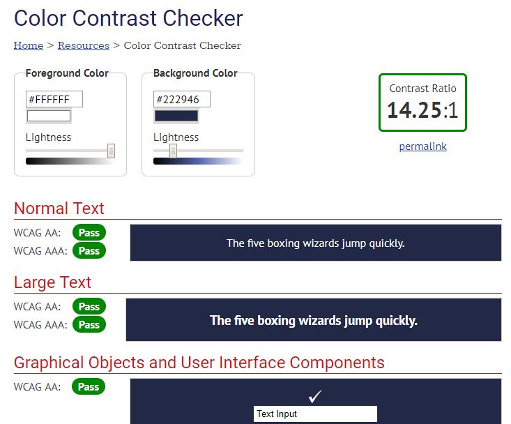
This is the Color Contrast Checker, which shows the contrast ratio between foreground and background colours and gives a pass or fail mark. I have tested the colour of the header.
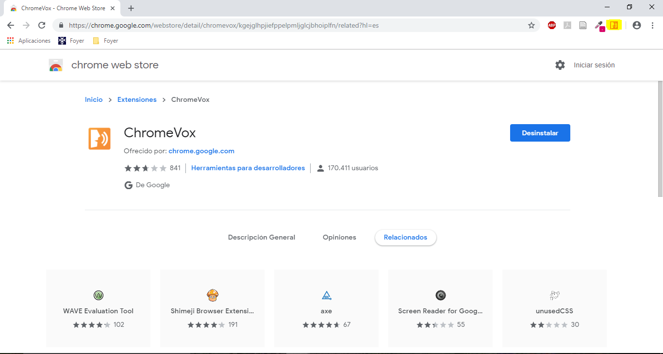
I dowloaded ChromeVox, a screen reader extension available for Chrome.